What Colour Curtains Go With....?
If you want to freshen the look of a room by changing the curtains but don't know how to coordinate window coverings with walls, floors and furnishings, let your imagination soar.

When it comes to colour, top designers are disregarding traditional colour schemes and using bold colours in tight palettes. Using hues within families of colour is the key to bringing it all together. Texture and pattern can highlight, or tone down, colours in the palette.
Colour can open small spaces, create a niche within a space or minimize large spaces. If you want to match new curtains with other elements such as carpets or walls, here are a few tips and guidelines.
Replicate Nature
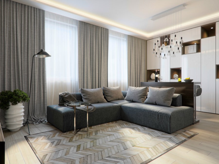
When we look at the outside world, there are gradations of dark and light from earth to sky. The earth is dark, often in shades of grey, brown and terra cotta. The space between earth and sky is full of colour, such as the variegated shades of green in trees, brightly coloured flowers and hues of the built landscape. The sky is brighter and lighter. Many decorators use this gradation from dark to light to coordinate colours in a room.
If your floors are dark, use lighter shades on the vertical plane from floor to ceiling. Window coverings can play to either the light or the dark according to the mood you want to create. For an airy, light-filled space, use lighter colours and light-weight fabrics. To accentuate darker hues, try heavier fabrics that diffuse or block light.
Classic colours also come from nature. The golden-yellow hues of sunshine blend well with shades of green reminiscent of trees or with turquoise seen in the sea and water. Greys and tans evoke rock and sand. If your space is predominantly earth tones, use curtains to add a pop of colour. Cherry red or ocher curtains can enliven the room without overwhelming it. Just make sure it is a colour you can enjoy for a long time.
Use Classic Colour Combinations
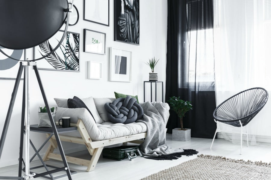
Some colour combinations never go out of style. Perhaps the most classic is black and white. Black evokes a feeling of formality and dignity. White gives a feeling of light and purity. If you have white walls, pick a soft shade of black for windows. The dark curtains contrasting with the light walls create a focal point at the window. A soft shade of black offsets the dense saturation of pure black. Layering gives the best of both worlds. Use the dark colour for mood, thermal insulation or to keep light out. White sheers give privacy as well as light filtering when the dark curtains are open.
Many designers combine hues of orange with shades of blue. Navy and tangerine or sky blue and persimmon are examples. Play off these colours with hues in the same family. Texture can be used to accentuate a shade. Pattern can combine several colours that echo the palette of the room.
Blue and white are a favorite combination. The many shades of blue, as diverse as cobalt blue, navy, turquoise, denim and robin's egg, all contrast nicely with white. Patterns set a theme. Gingham and plaids give a country feel, while geometric prints complement a modern or minimalist theme. Paisleys or repeating patterns in large motifs play up the window. Curtains without patterns soften the window. Although patterns may highlight a dominant colour of the room, pattern can also echo other shades.
Another way to use classic colour combinations is to pick two predominant colours from the room and expand the palette by adding colour from the same family. Several designers recommend using a scale of 60-30-10 to balance colour. If you have a predominant colour in the room, curtains can balance the ratio. For example, in a room with a predominance of navy blue and a secondary colour of deep reds, curtains can combine secondary and accent colours without overwhelming the scheme. Pillows, throw rugs and other accessories can play up colour and pattern.
Use Pattern and Texture
If you tend toward a monochrome decorative scheme, pattern and texture will enliven your space. Window dressings, area rugs and throw pillows can change the feel of a room. Mixing and matching types of patterns, sizes of patterns and colours will transform a ho-hum room to a vibrant one. Texture can also add to the décor.
Don't be afraid to mix patterns. There are, however, some basic rules that make mixing patterns come together. You can apply the 60-30-10 ratio for room colour to pattern and texture as well. Choose three different designs, such as chevrons, polka dots and florals. Varying the size of two of the patterns makes each distinctive and creates interest. If you use a floral for curtains, try throw pillows in the same floral. Contrast the floral with a small geometric pattern and a stripe. The key is to coordinate colours and hues. Use one colour as the theme, and use related colours for contrast and interest. Balance patterns with solids so that the eye is not overwhelmed.
Interesting patterns for curtains include ikat, plaids, toile, florals, chevrons and paisleys. Each sets a mood. Florals are romantic. Paisleys can give a bohemian look or add a touch of formality to a room. Chevrons speak energy. They work well in sunrooms, beach houses and bathrooms. Toile is elegant and formal. Pair toile with a contrast in pattern, not a floral.
Damasks and jacquards use elements of both texture and design to set a mood. Damask is elegant and formal, traditionally made of wool, silk or linen. The subtlety of design is created by the weaving technique, which uses the threads in the warp and weft to create contrast in colour, sheen and texture. Damask has a raised pattern that is seen in reverse on the opposite side. Damask holds up well, repels water and is timeless in look. Jacquards are similar, but the texture is flat instead of raised. Both work well as draperies and can also be used as throw pillows for a repeating theme of colour, texture and design.
Consult the Colour Wheel
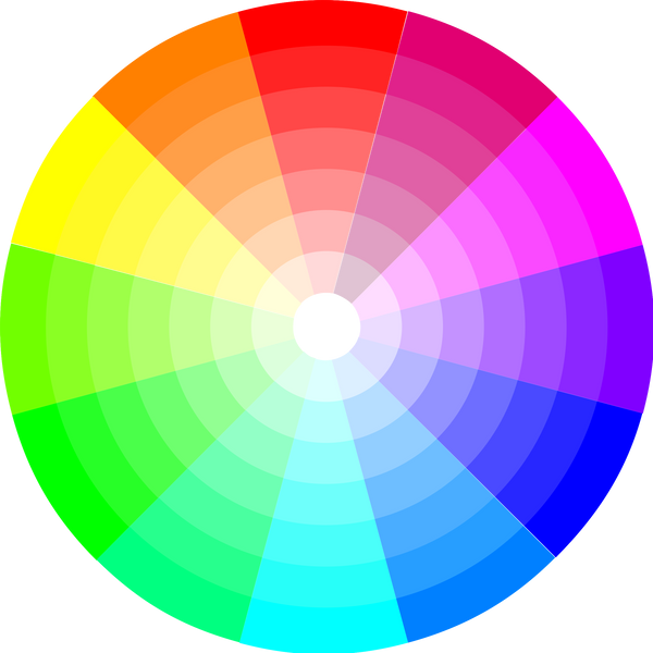
Decorators and designers rely on the colour wheel to find compatible colours and see how colours relate. The wheel shows hues around a circle, illustrating the relationship of primary, secondary and tertiary colours to one another. The three primary colours are red, blue and yellow. The three secondary colours are green, violet and orange. Tertiary colours are hues of these shades as they go around the wheel: red-orange, yellow-orange, yellow-green, blue-green, blue-violet, and red-violet. The colours opposite one another are complementary colours. Blue is opposite orange, one reason that decorators pair these two colours together. Yellow is opposite violet, and red is opposite green.
Adjacent colours are called analogous colours. These colours can be used to vary tone or create highlight. If red is a dominant colour, it can be softened by using red-orange or red-violet. You can see how colours can set a mood and reflect light. Pairing opposite colours can create a vibrant look. Toning a colour down with white or deepening it with black also adds to a look. Although they are not on the colour wheel, neutrals, such as tan, white, grey and black, are used to soften or contrast colour. The pattern and colour of curtains can be used to complement, enhance or dominate the colour scheme of a room, all based on the science of the colour wheel.
Choose the best colour for your curtain . Click here!
Contrast Warm and Cool
As you select colours for your curtains and accessories, consider how colours affect feelings and comfort. Colours evoke feelings of warmth and coolness. Cool colours include blues, greens and violets. Cool colours are associated with water, sky and grass. They are calming and soothing, appealing to the intellect. Warm colours include yellows, oranges and reds. Warm colours denote heat, fire and sunshine. They are stimulating, appealing to the emotions. Looking at the colour wheel, we see that warm and cool colours are on opposite sides of the wheel. This is because each colour absorbs and reflects light differently. Light colours reflect light more than dark colours do.
Black and white also denote warmth and coolness. White is cool, and black is warm. Neutrals do not have much pizzazz by themselves even though particular shades may have warm or cool hues. However, when paired with colour, they add sophistication and excitement or tone down intensity.
By contrasting warm and cool colours, you can play up mood and enhance a feeling of comfort. If you live in a hot climate, go with cool colours at the windows of living rooms and bedrooms. If you live in a cool climate, warm colours at the window will contribute to a feeling of warmth indoors.
Pairing curtain colour with the room's purpose contributes to the ambience. Deep, warm colours such as burgundy complement dining rooms, where guests want to feel cozy. Often bathrooms and bedrooms are decorated in cool colours because these are places where you want to relax. Bright red curtains at a bedroom window may affect your sleep. The key is balance. If your walls and flooring are in cool colours, try warm colours for curtains and accessories to balance the look.
Go With Your Feelings
If you like a colour, explore it. Almost any colour can be used if attention is paid to scale, intensity of hue and how it is combined with others. Analogous colours on the colour wheel are often considered to clash, such as using red and orange together. However, if you use an analogous colour for a hint of contrast or to lessen the intensity of the hues, it can work. In the 60-30-10 scheme, a fourth colour can be added by splitting the secondary colour.
If in doubt, take colour swatches home. See how your choices match wall colour, floor coverings and furnishings. Think about the mood the colours and patterns will set. If you have antique carpets for flooring, you may prefer to let them be the focal point. Use one of the carpet's secondary colours at the windows to complement and enhance. If your floors are herringbone wood, a paisley drapery in rich colours will complement both the pattern and the warmth of the wood.
Your living space should reflect your taste and lifestyle. Although there are basic rules that help bring a space together, ultimately it has to appeal to your sense of beauty. Explore your tastes and experiment. If you have a basic palette to work with, accessories and window coverings can be easily changed to reflect seasons, mood and taste.